|
|
Post by Valand on Jan 25, 2009 19:54:43 GMT -5
Okay so we need a button, everyone who feels like making one, PLEASE, PLEASE post it here then we can all have input to decide which will be our button ^^ The dimensions of the buttons you make should be 88px by 31pxHere are the ones I made:    |
|
|
|
Post by kushiel on Jan 25, 2009 20:09:10 GMT -5
Bored so I thought I'd contribute. =]  |
|
Rine //
New Member
 Tell me whyyy are weee / So bliiiind to seeee / That the onnnes we huuurt / Are you and me[Mo0:0]
Posts: 35
|
Post by Rine // on Jan 25, 2009 21:25:27 GMT -5
Eh heh. *scratches head*
As you've probably guessed, my computer isn't fixed yet.
And, even worse, I don't know when it will be.
Hopefully before I die of shame :/
|
|
|
|
Post by Valand on Jan 26, 2009 10:57:14 GMT -5
Eh heh. *scratches head* As you've probably guessed, my computer isn't fixed yet. And, even worse, I don't know when it will be. Hopefully before I die of shame :/ Daww' its okay XD |
|
|
|
Post by Brennus on Jan 26, 2009 17:32:53 GMT -5
  You guys got me beat on these little thingers, but I wanted to give a little design hint for anyone to consider if they want. Not trying to push this idea, I'm just saying what I know. I personally think that color realistic icons tend to mesh together with the 20 or so others on the page, especially when your jumping from forum to forum looking for the one that's right for you. It's best to get an icon that stands out from the other ones. If you know your color wheel, mixing the two opposite colors will make anything pop out more. Personally I don't like the color combos, but I can't really tell the eye how to work lol, and I have to admit that they do pop out more. Red- green Yellow-purple blue-orange etc quick examples  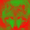 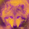 |
|
|
|
Post by kushiel on Jan 28, 2009 13:58:03 GMT -5
Personally I like the yellow/purple combo.
My input.
|
|
|
|
Post by Sahtara on Jan 28, 2009 22:56:13 GMT -5
  You guys got me beat on these little thingers, but I wanted to give a little design hint for anyone to consider if they want. Not trying to push this idea, I'm just saying what I know. I personally think that color realistic icons tend to mesh together with the 20 or so others on the page, especially when your jumping from forum to forum looking for the one that's right for you. It's best to get an icon that stands out from the other ones. If you know your color wheel, mixing the two opposite colors will make anything pop out more. Personally I don't like the color combos, but I can't really tell the eye how to work lol, and I have to admit that they do pop out more. Red- green Yellow-purple blue-orange etc quick examples    Yeah, I like the purpleXyellow |
|
|
|
Post by Sahtara on Feb 5, 2009 18:17:01 GMT -5
 Here's the last one I came up with |
|
|
|
Post by kezune on Feb 6, 2009 16:20:56 GMT -5
Do like
|
|
Demolise
New Member
 It is a sin to believe evil of others, but it is seldom a mistake[Mo0:0]
Posts: 20
|
Post by Demolise on Feb 7, 2009 7:39:06 GMT -5
their all so pretty  |
|